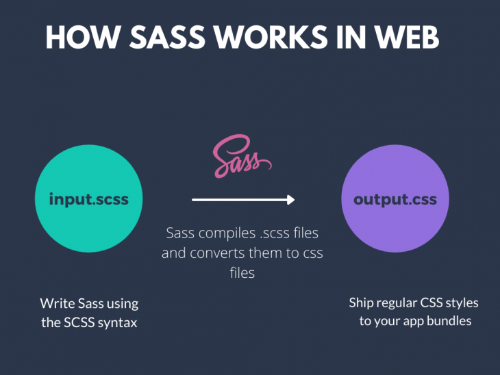
Sass, which stands for "Syntactically Awesome Style Sheets," is a pre-processor that helps you write, structure, and organize CSS code. It's widely used today as an alternative to raw CSS for styling large web applications.
In fact, many modern CSS frameworks and libraries like Bootstrap are also written in Sass. It allows developers to use variables, mixins, modules, partials, and operators in their CSS styles.
While Sass is popularly coupled with frontend frameworks like React, you can also use it in your React Native projects. In this guide, I'll walk you through how you can configure and use Sass in your React Native app, but first, let's understand how Sass works.
How Sass works
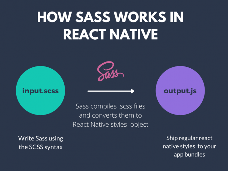
Sass is only a development time tool and not an extension to the CSS standard. This means that when you use webpack or a module bundler to build your code, it compiles your Sass files too. In the web ecosystem, your Sass files are saved with the .scss extension instead of the regular .css extension. The SCSS stands for "Sassy CSS" and provides a syntactic sugar that's similar to CSS.
You can also write raw CSS inside your Sass files because every valid CSS is also a valid SCSS. However, vice versa is not true.
Since React Native does not use CSS but style objects, your Sass files are also converted to React Native style objects under the hood.
This gives you an important advantage of writing raw CSS to style your React Native components. Your React Native project compiles your Sass files at runtime and converts them to regular JavaScript objects.
Now that you understand how Sass works, let's set it up inside our React Native project. For this purpose, we'll use the package react-native-sass-transformer.
Set up Sass in React Native
The react-native-sass-transformer package allows us to easily configure, set up, and use Sass in any kind of React Native project. It also uses the package node-sass as a dependency for providing the Node binding to Sass.
Let's start by creating a new React Native project:
npx react-native init rn-sass-app
You can install both the dependencies in your project by running the following command:
npm install react-native-sass-transformer node-sass
Once you have created the project along with the above dependencies, you need to make some additional configurational changes. In the root directory, add the following configurations to your metro.config.js file:
const { getDefaultConfig } = require("metro-config"); module.exports = (async () => { const { resolver: { sourceExts } } = await getDefaultConfig(); return { transformer: { babelTransformerPath: require.resolve("react-native-sass-transformer") }, resolver: { sourceExts: [...sourceExts, "scss", "sass"] } }; })(); If you're using Expo CLI, you'll need to explicitly create a metro.config.js file inside the root directory. You will also need to tell Expo to load these configurations in the project by making the following adjustments to your app.json file:
{ "expo": { ... "packagerOpts": { "config": "metro.config.js", "sourceExts": ["js", "jsx", "scss", "sass"] } ... } } Once the above changes are complete, you'll be able to use Sass in your Expo CLI or React Native CLI projects.
Using Sass to style your React Native components
Inside the project, let's create a new file called App.scss where we can write the Sass styles for our <App/> component. Inside the App.scss file, let's add the following styles:
.container { display: flex; flex: 1; justify-content: center; align-items: center; background-color: #333; } The above styles are written in pure CSS, but since we're using the .scss extension, our app will be able to compile these styles. Note that we have used a class selector .container to define our styles.
In order to use the above styles inside our App.js file, we first need to import them:
import Appstyles from './App.scss';
Let's simply log the Appstyles object to the console to see what these styles look like:
console.log({Appstyles}) You'll notice that our CSS styles have been compiled to a plain JavaScript object:
Object { "Appstyles": Object { "container": Object { "alignItems": "center", "backgroundColor": "#333", "display": "flex", "flexBasis": 0, "flexGrow": 1, "flexShrink": 1, "justifyContent": "center", }, }, } We can now use these styles like any regular React Native styles object inside the App.js file:
export default function App() { return ( <View style={Appstyles.container}> <Text>Open up App.js to start working on your app!</Text> </View> ); } The above should make our <App/> component look like this:

Thus, with Sass you can even write your styles in pure CSS. Let's refactor our above styles in SCSS now.
Using variables in Sass
Sass allows us to create variables to store information that we can use in various style blocks. We can create a Sass variable using the $ prefix. Let's create the following variables inside our App.scss file:
$background-color: #333; $primary-color: #d3d3d3; $font-large: 20px;
Instead of hardcoding font sizes and colors, we can use variables to set different font sizes to texts, background colors to our containers, etc. Let's use the above variables to style the <View/> and <Text/> component:
$background-color: #333; $primary-color: #d3d3d3; $font-large: 20px; .container { display: flex; flex: 1; justify-content: center; align-items: center; background-color: $background-color; padding: 20px; } .text { font-weight: 700; text-align: center; font-size: $font-large; color: $primary-color; } Let's use the above styles inside our App.js file:
export default function App() { return ( <View style={Appstyles.container}> <Text style={Appstyles.text}>Open up App.js to start working on your app!</Text> </View> ); } We should now see our <Text/> component styled differently:

Great! Let's now look at how we can reuse our styles for different selectors in Sass using inheritance.
Using inheritance in Sass
One of the most fruitful features of Sass is that it lets you reuse a set of styles amongst a number of selectors.
Much like how we can define variables for a style rule, we can define a placeholder class that contains a set of style rules using the % symbol. We can then reuse these styles wherever we want.
To demonstrate, let's create some more variables inside our App.scss file:
$light: #fff; $purple: purple; $blue-violet: blueviolet; $box-dimension: 100;
Now, let's define a placeholder class called box-shared that has the following styles:
%box-shared { box-shadow: 0 0 1px rgba(0, 0, 0, 0.25); border: 1px solid #ccc; padding: 10px; height: $box-dimension; width: $box-dimension; margin-bottom: 100px; } We can now use the styles defined inside our box-shared placeholder class in different selectors. The above styles can be used as the general styles we want to associate with any box class we want to use.
For instance, let's say we want to render a white box on the screen. Instead of rewriting the above styles, we can inherit the above styles using the @extend keyword:
.boxWhite { @extend %box-shared; background-color: $light; } The above .boxWhite class will contain all the styles defined in box-shared class. Let's render a simple <View/> component to display the above styles:
export default function App() { return ( <View style={Appstyles.container}> <View style={Appstyles.boxWhite}> </View> </View> ); } We should now see a white box on the screen as shown:

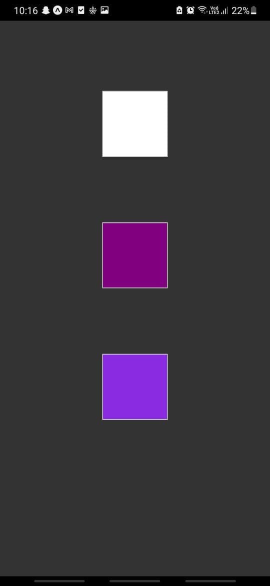
We can use extend or inheritance if we want to add similar UI elements that can reuse some common styles. For instance, we can create styles for more boxes of different colors as shown:
.boxPurple { @extend %box-shared; background-color: $purple; } .boxBlueViolet { @extend %box-shared; background-color: $blue-violet; } And then use these classes inside our component:
export default function App() { return ( <View style={Appstyles.container}> <View style={Appstyles.boxWhite}/> <View style={Appstyles.boxPurple}/> <View style={Appstyles.boxBlueViolet}/> </View> ); } The above should render three boxes of different colors as shown:
Awesome! Before we wrap this up, let's see how Sass allows us to do simple mathematical calculations while writing our styles using operators.
Using operators in Sass
We can use operators to dynamically calculate height, width, padding, margin, and other such properties for our elements. Head back to the App.scss file and create another variable:
$box-dimension-lg: 250;
Let's also create an extend class that contains our flexbox styles:
%flex-box { display: flex; justify-content: center; align-items: center; } Let's alter the styles of our box-shared placeholder class as shown below:
%box-shared { box-shadow: 0 0 1px rgba(0, 0, 0, 0.25); border: 1px solid #ccc; padding: 10px; height: $box-dimension-lg; width: $box-dimension-lg; margin-bottom: 100px; border-radius: 10px; } Also, let's update the styles of our boxWhite class we used in the previous section:
.boxWhite { @extend %flex-box; @extend %box-shared; background-color: $light; } If you noticed, we inherited the styles of two classes inside our boxWhite class, which is perfectly fine.
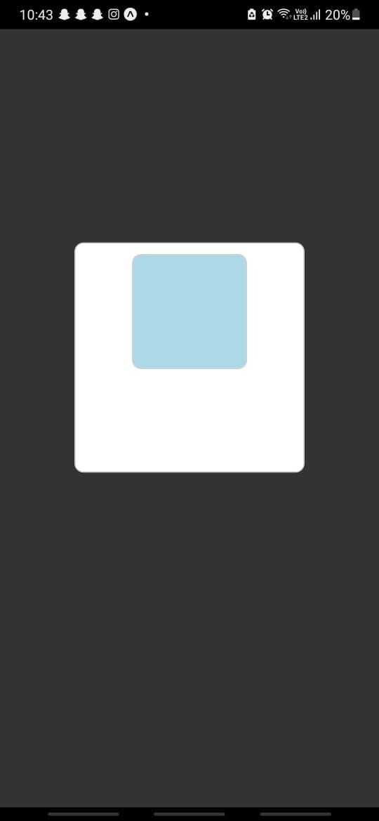
I now want to create another box that is always going to have half the height and width of its parent box. Since we'll render this box inside the white box with the boxWhite class, we can use the $box-dimension-lg to calculate the height and width of the box:
.boxInside { @extend %box-shared; background-color: lightblue; height: ($box-dimension-lg/2); width: ($box-dimension-lg/2); } Let's also render this box inside our App.js file:
export default function App() { return ( <View style={Appstyles.container}> <View style={Appstyles.boxWhite}> <View style={Appstyles.boxInside}/> </View> </View> ); } We should now see a box of half the dimensions of its parent box that lies inside it:
You can use all the operators like +, -, *, /, and % for calculating the values inside your rules.
Conclusion
Sass can really simplify your CSS styles and rules with the help of variables and inheritance. It helps you to write more clean and concise styles for your React Native application. You can also reuse your Sass styles easily between your web and React Native projects.
There are other useful features that Sass provides such as modules, mixins, functions, etc. You can check out the official docs to explore further. Until next time!


No comments:
Post a Comment
Note: Only a member of this blog may post a comment.