Tailwind, Bootstrap, and other CSS frameworks out there are great. They help you get your work done fast, and all — but these frameworks are also limited in terms of customization and extensibility.
With Tailwind, for example, you are limited to the utility classes its team created for controlling an element's margin and padding. While they might have curated a huge list for common cases, there are still some occasions where you want to define a custom value, and in situations like this, you'll need to go through an extra step of creating an external style for this element.
Also, almost all of these frameworks are shipped with hundreds of classes that you might not use in your project, and this not only affects your webpage load time negatively, it also affects your productivity as a developer because you have to learn hundreds of classes.
Assembler CSS fixes this.
What is Assembler CSS?
Assembler's documentation describes it as "a modern UI framework designed to be highly performant on both desktop and mobile devices while providing a full range of features that could hardly be matched by a static CSS framework."
Assembler CSS is:
- easy to learn
- fast and highly performant
- lightweight — weighing ~8kB (gzip) in size
- extensible — you can easily integrate Assembler CSS with other CSS frameworks
And in this tutorial, we will be exploring how to start using Assembler CSS in your project, along with the features this framework offers.
Installation
One of the easiest ways to get started with implementing assembler CSS is to include its CDN in the head section of your webpage markup as shown below:
<!DOCTYPE html> <html lang="en"> <head> <meta charset="UTF-8" /> <meta http-equiv="X-UA-Compatible" content="IE=edge" /> <meta name="viewport" content="width=device-width, initial-scale=1.0" /> <script src="https://unpkg.com/@asmcss/assembler/dist/assembler.min.js"></script> <title>Learning Assembler CSS</title> <style></style> </head> <body></body> </html>
You can also install Assembler CSS with npm or yarn using the following command:
npm install @asmcss/assembler # OR yarn yarn add @asmcss/assembler
Getting started
Assembler CSS introduces a new x-style attribute to HTML elements, which is similar to how the default HTML style attribute works but better. To demonstrate this, consider the code below:
<div style=" width: 100px; height: 100px; background: #ff5722; border-radius: 50%; margin: auto; "></div>
Which produces the following output:

This component can be recreated using the same CSS properties and values with the x-style attribute:
<div x-style=" width: 100px; height: 100px; background: #ff5722; border-radius: 50%; margin: auto; "></div>
You would notice that the only difference between the two code blocks is changing the style attribute to x-style. While this might look uninteresting, this is to explain how easy it is to use Assembler CSS, and in the coming sections, we will be exploring the powerful features this framework offers in-depth.
Virtual properties
Assembler CSS evolves around virtual properties, which is a curated list of almost all CSS properties shortened, with inspiration drawn from popular CSS frameworks like Bootstrap and Tailwind. This is similar to how utility classes work, but this time with custom value.
Using virtual properties, we can rewrite our previous example like below:
<div x-style="w:100px; h:100px; bg:#643296; radius:50%; m:auto;"></div>
We can see that this is less cumbersome and easier to read, and running the code will produce the same output:
It is worth mentioning that some virtual properties have associated default values, and some of this can be mapped to different properties depending on their value. One example that falls under this category is the flex property that maps to display: flex; if no value is specified. Or to control the flexible length on flexible items (e.g., flex: auto;) if a value is specified:
<div x-style="flex; flex:auto"></div> <!-- is an equivalent of --> <div x-style="display:flex; flex:auto"></div>
CSS variables
The Assembler CSS x-style also lets you access CSS variables easily, using the @ symbol followed by the variable name, or using the standard var() syntax:
<style> :root { --primary: #3f51b5; --secondary: #673ab7; } </style> <p x-style="color:@primary">Hello World!</p> <p x-style="color:var(--secondary)" lang="es">Hola Mundo!</p> States
Another awesome feature in Assembler CSS is changing the style for different states; i.e., you can change the color of a button when the user hovers on it, directly from the x-style attribute.
Although other CSS frameworks like Tailwind already offer features like this one, with Assembler CSS, you get to define custom values for each state change.
We can use this feature in Assembler CSS by appending the period symbol . to the property name, followed by the name of the state you want to target.
For example, changing the border of an input element on focus will look like this:
<input x-style="border: 1px solid #ccc;border.focus: 2px solid #ccc;" type="text" />
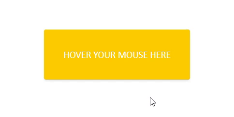
Below is a more detailed example that changes the background color of the div to black when the user hovers their mouse on it:
<div x-style=" bg: #ffcc00; bg.hover: #1f1f23; color: #fff; p: 40px; text: 20px; radius; shadow; "> HOVER YOUR MOUSE HERE </div>
One downside to using this feature is that you'll need to attach your state to the property you want to modify during each state change, which might make our code more robust.
Say we want to change the background color, text color, and text size when the user hovers on the div. In our previous example, here is what our code will look like:
<div x-style=" bg: #ffcc00; bg.hover: #1f1f23; color: #fff; color.hover: #ccc; text: 20px; text.hover: 30px; "> HOVER YOUR MOUSE HERE </div>
Media breakpoint
Crafting responsive design with Assembler CSS is straightforward.
Unlike frameworks like Bootstrap and Tailwind that only let you modify properties like margin, display, and padding on desktop and mobile devices, Assembler CSS lets you easily modify all of the virtual properties it offers directly from the x-style attribute, for multiple breakpoints.
We can target a specific breakpoint by prefixing a virtual property name with the | symbol and the breakpoint name:
<div x-style="bg:red; sm|bg:green; md|bg:blue; w:150px; h:150px; mx:auto"></div>
Running the code above will display a green box on small devices, a blue box on medium-sized desktops and tablets, and a red box on other devices.
Supported breakpoints include:
xs — extra small devicessm — small devicesmd — medium deviceslg — large devices, andxl — extra large devices
Mixins
Mixins might be one of the most useful features in Assembler CSS because they allow you to write reusable style rules that can be applied to multiple elements.
Mixins are created by appending the word --mixin to CSS variables, and we can apply them to our element (via the x-style) attribute by prepending the mixin's name with the ^ symbol:
<style> :root { --btn--mixin: "px:10px; py:10px; rounded; font-weight:bold; outline:none; border:none;"; } </style> <button x-style="^btn">Click Me</button> Mixin arguments
In assembler CSS, you can also pass arguments to mixins while applying them and then access these arguments as parameters during the creation of your mixins.
Arguments inside of a mixin can be accessed by using ${index}, where index is the zero-based index of the argument:
<style> :root { --btn--mixin: "px:10px; py:10px; rounded; font-weight:bold; outline:none; border:none;"; --btn-bg--mixin: "color:#fff;bg-color: ${0}; } </style> <button x-style="^btn ^btn-bg:tomato">Click Me</button> In the code sample above, we'd first created a mixin (btn) that helps apply basic styling to our button, and afterward created a new mixin btn-bg that modified the color of our button. And in our button element, we passed the argument by prepending the mixin name with a colon :, followed by our argument value.
Conclusion
Assembler CSS helps you build beautiful UI components without installing and maintaining complicated software stacks. And in this tutorial, we went over how to install this framework, as well as an in-depth guide into its features.
It's also worth mentioning that Assembler CSS is a pretty new CSS framework with its first release on 11 August 2021, meaning we should expect tons of exciting updates in the near future.


No comments:
Post a Comment
Note: Only a member of this blog may post a comment.