ants123456789 posted: " We continue to explore the shape transformation using CSS in our part 2 series. This article will review on transform style properties to show the shape in 3d form compare with a flat transform. Let discuss here on using CSS to create 3d shape. Transf"
We continue to explore the shape transformation using CSS in our part 2 series. This article will review on transform style properties to show the shape in 3d form compare with a flat transform. Let discuss here on using CSS to create 3d shape.
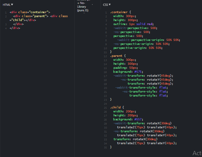
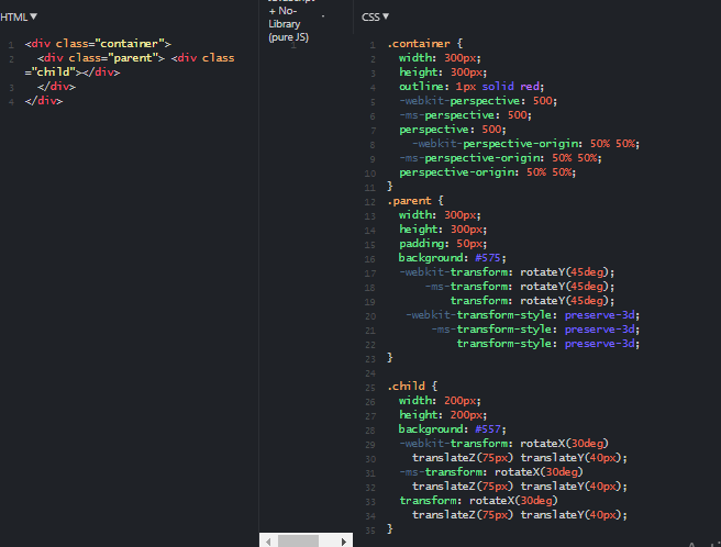
Transform Style Property
Transform-style has 2 available values : flat and preserve-3d.
Its property controls whether or not the children element render in flat 2-d space or 3-d space.
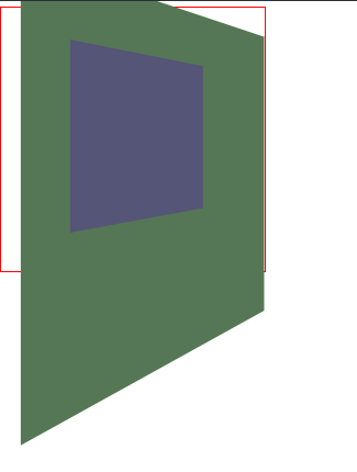
Parent element setting in 2-d space and its child element in 3-d has no inter-relation impact.
Let work on 2 example, 2-d flat and 3-d transform.
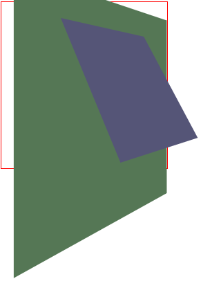
This example 3-d transform using transform-style: preserve-3d.
Backface-visibility Property
The name hints at what the property does. It determines if the back side (or face) of a transformed element is visible when it's facing the viewer.
When rotating a object 180 degrees, you expect to see the reverse side of the that object.
The text in the object will be reversed as well, hence, you will want to visible and hidden to show the correct text when rotating.
Once the text is placed identical in the 2 components and toggle using the backface-visiblity to hidden the reverse text.


 WordPress.com


No comments:
Post a Comment
Note: Only a member of this blog may post a comment.