A time-series graph is a line plot that displays trends or patterns over a dataset collected over an interval of time. For example, when you visualize a line plot of the daily sales made by a business, you are visualizing a time-series graph. It is one of the most important data visualizations for every data scientist. So if you want to learn how to visualize it using Python, this article is for you. In this article, I will take you through a tutorial on visualizing a time series graph using Python.
Time Series Graph
A time-series graph is a line plot used to visualize time series data. Time-series data is the data collected over an interval of time. Some of the popular examples of time series data are stock price data, daily sales data, daily covid cases data, etc.
While visualizing a time-series graph, the time intervals lie on the x-axis, and the data points collected over those time intervals lie on the y-axis. For example, while visualizing a time-series graph of stock price data, the date column will lie on the x-axis, and the price column will lie on the y-axis.
I hope you now have understood what a time series chart is and why it is used in data science. Now, in the section below, I will walk you through how to visualize a time series graph using Python.
Time Series Graph using Python
To visualize a time series graph using Python, I will be using a stock price dataset. There are many libraries in Python for data visualization; I will be using Plotly as it is easy to visualize interactive visualizations using plotly. So let's start this task by collecting the latest stock price data of Apple:
import pandas as pd import yfinance as yf import datetime from datetime import date, timedelta today = date.today() d1 = today.strftime("%Y-%m-%d") end_date = d1 d2 = date.today() - timedelta(days=360) d2 = d2.strftime("%Y-%m-%d") start_date = d2 data = yf.download('AAPL', start=start_date, end=end_date, progress=False) print(data.head()) Open High ... Adj Close Volume Date ... 2021-01-19 127.779999 128.710007 ... 127.046783 90757300 2021-01-20 128.660004 132.490005 ... 131.221054 104319500 2021-01-21 133.800003 139.669998 ... 136.031372 120150900 2021-01-22 136.279999 139.850006 ... 138.217926 114459400 2021-01-25 143.070007 145.089996 ... 142.044327 157611700 [5 rows x 6 columns]
The above data is collected by using the yfinance API. You can know more about it from here. Now below is how you can visualize a time series graph using Python:
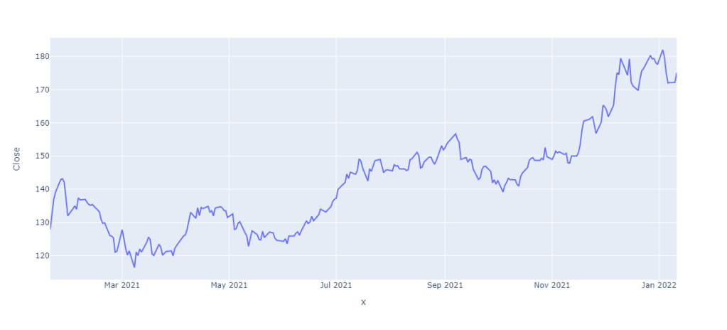
import plotly.express as px figure = px.line(data, x = data.index, y = "Close") figure.show()
Summary
A time-series graph is a line plot used to visualize time series data. Time-series data is the data collected over an interval of time. While visualizing a time-series graph, the time intervals lie on the x-axis, and the data points collected over those time intervals lie on the y-axis. I hope you liked this article on visualizing a time series chart using Python. Feel free to ask valuable questions in the comments section below.


No comments:
Post a Comment
Note: Only a member of this blog may post a comment.