If you've spent time on social media, you've probably seen one of your friends change their Facebook profile picture to include a frame supporting their favorite sports team. Or, you may have seen a colleague's LinkedIn profile with a frame about openness to work. In this article, we'll build our own profile picture frame generator in React using React Konva.
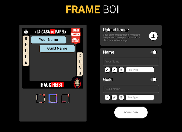
As an example, we'll use a frame generator that I helped to build and maintain for my university's Hackathon. At the end of this tutorial, you'll be able to build a profile frame generator for your online event participants to use. Our final output will look like the image below:
You can also check out the live example. Let's get started!
What is React Konva?
The HTML5 Canvas API is a powerful tool for incorporating dynamic, performant visuals in web apps. Canvas supports a wide range of browsers and includes built-in APIs for adding shapes, pictures, and text. A variety of utility libraries like Konva.js and p5.js have been created on top of Canvas to assist with event handling and animations.
The Canvas API is essentially imperative, and it was built to interact with vanilla JavaScript with methods like ctx.rect(x, y, width, height). This syntax is completely alien to React developers and is incompatible with modern React patterns. React Konva, a React wrapper for Konva.js, allows you to use React component interfaces to connect with the Konva API.
Prerequisites
To follow along with this article, you should be familiar with React and Create React App. You should also have an understanding of state management tools like Redux or the React Context API. Additionally, prior knowledge about React Konva is beneficial.
In this tutorial, we'll use the following technologies: React, Create React App, styled-components, the React Context API, React Konva, and Netlify. Let's get started!
Getting started
First, we'll install Yarn to make our development process much smoother:
# Globally install yarn npm install -g yarn
Next, we'll create a basic React app using Create React App. To run this command, you'll need to have Node.js installed. You can check whether Node.js is installed using the command node --version. Installing Node.js will automatically enable the npm and npx commands:
# Using npm npx create-react-app profile-frames # Using yarn yarn create react-app profile-frames
Let's set up a clean directory structure; delete all the files that come with Create React App and create the required folders and files as shown below:
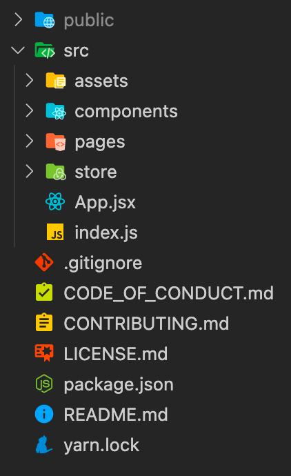
public: Files in this directory will be directly accessible to the userssrc: Contains the files that we'll upload and build assets: Contains all images and framescomponents: Contains componentspages: Contains different screens for our applicationstore: Contains files handling the app's global state management
To run your React app, create index.js and App.jsx files in the src directory, then add the following code:
// App.jsx import React from "react"; const App = () => { return ( <div> <h1>Hello World</h1> </div> ); }; export default App; // index.js import React from "react"; import ReactDOM from "react-dom"; import App from "./App"; ReactDOM.render( <React.StrictMode> <App /> </React.StrictMode>, document.querySelector("#root") ); Finally, we'll install styled-components and React Konva for CSS styling and canvas manipulations, respectively:
yarn add styled-components react-konva konva
In this article, we won't focus on CSS styling in great detail. You can find the details of specific implementation in the repository above.
Listing our app's features
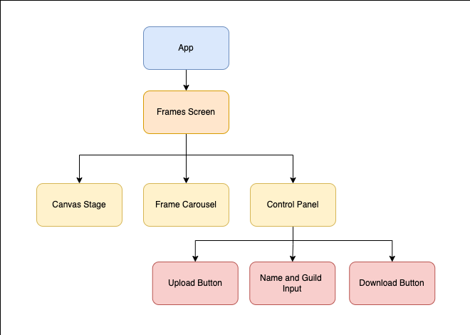
Before we begin coding, it's good practice to make a detailed list of the features we want to include. Our app will include the following features, and we'll build our components based on this list:
- A
Stage component where the user can interact with different Konva elements - A carousel consisting of various frame options for the user to choose from
- A control panel consisting of the following:
- An
upload image button Name and Guild inputs- A
Download button
The component architecture below will be suitable for our project:
Creating the Canvas component
React Konva has a component called Stage that you can use to render various shapes and items. The immediate child component of Stage needs to be a Layer component, which can then house different components like images, texts, shapes, etc. In our demonstration, a single layer would get the job done.
Create a new file named Canvas.jsx in the components directory and add the following code:
import React, { useRef } from "react"; // Libraries import { Layer, Stage, Image, Text } from "react-konva"; // Assets import frame1 from "../assets/frame1"; import profile from "../assets/frame1"; const Canvas = () => { /** * A list of variables containing the various details that we * would require for all the different elements. * * It is better to separate them now as we will be shifting * them to their global states later */ const stageRef = useRef(); const stageDetails = { width: 350, height: 350, x: 0, y: 0, }; const imageDetails = { originalDimensions: { width: 0, height: 0, }, renderDimensions: { width: 300, height: 300, }, position: { x: 0, y: 0, }, }; const textDetails = { name: { value: "name field", id: "user-name", dimensions: { width: 100, height: 50, }, position: { x: 50, y: 50, }, }, guild: { value: "guild field", id: "user-guild", dimensions: { x: 100, y: 50, }, position: { x: 100, y: 100, }, }, }; return ( <Stage ref={stageRef} width={stageDetails.width} height={stageDetails.height} style={{ position: "relative" }} > <Layer> <Image image={profile} width={imageDetails.renderDimensions.width} height={imageDetails.renderDimensions.height} x={imageDetails.position.x} y={imageDetails.position.y} /> <Text text={textDetails.name.value} width={textDetails.name.dimensions.width} height={textDetails.name.dimensions.height} x={textDetails.name.position.x} y={textDetails.name.position.y} /> <Text text={textDetails.guild.value} width={textDetails.guild.dimensions.width} height={textDetails.guild.dimensions.height} x={textDetails.guild.position.x} y={textDetails.guild.position.y} /> <Image image={frame1} width={stageDetails.width} height={stageDetails.height} x={0} y={0} style={{ position: "absolute", top: 0, left: 0, zIndex: 100 }} /> </Layer> </Stage> ); }; export default Canvas; There is a lot going on in this code snippet. Let's review the different props that are being passed to all the elements.
Each canvas element takes the following props:
width and height, specifying the dimensions of the particular componentx and y, specifying the position of the component
x and y are relative to the Stage component, starting from the top-left corner of the Stage component. The Stage component requires a reference, which is created using the useRef Hook.
There are two image components, one for the profile picture and one for the frame. These images should be high resolution, so we'll need to calculate the render dimensions for each image to fit inside the Stage component. Additionally, there are two text components that both have a text prop that renders the content, i.e., the text that we provide.
At this point, your next step would be to get the Stage component ready, but you'll notice a few issues. For one, the text that appears doesn't have a background. We'll need to fix it so it looks distinct from the images. Additionally, none of our elements are transformable, meaning we can't change the sizes or rotate the elements. Finally, our app is static, but we want to make it dynamic and interactive.
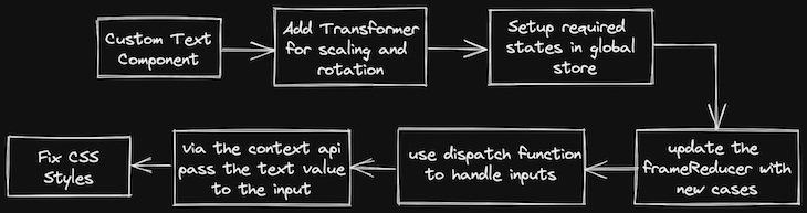
Creating a custom text component
The built-in text component doesn't include any background. We'll create our own custom component by using a text component placed on top of a Rect, Rectangle, component. React Konva provides a group component, which provides a single set of props, like dimensions and positions, to just one component instead of multiple.
Create a new file called CustomText.jsx and add the following code:
import React from "react"; // Libraries import { Rect, Text, Group } from "react-konva"; const CustomText = ({ dimensions, position, name }) => { const shapeRef = React.useRef(null); /** * As with other konva components, group also takes in * width, height and positions x and y. * * In addition to this, the properities of offsetX and offsetY * prop which shifts its coordinate system origin to the center instead * of the top-left corner are also added. * * This would help in positioning both the rectangle and the * text element at the center of the group. */ const groupProps = { width: dimensions.width, height: dimensions.height, offsetX: dimensions.width / 2, offsetY: dimensions.height / 2, x: position.x, y: position.y, }; return ( <Group ref={shapeRef} {...groupProps}> {/* The width of both the elements are kept same */} {/* Not passing any positions defaults them to x=0 and y=0 */} <Rect width={dimensions.width} height={dimensions.height} cornerRadius={[7, 7, 7, 7]} fill="lightblue" /> <Text width={dimensions.width} height={dimensions.height} align='center' verticalAlign='middle' text={name} fontSize={20} /> </Group> ); }; export default CustomText; Now, we have a custom text component that is more legible and easier to distinguish from the background image.
At this point, we've prepared the majority of our components. However, we're missing a key feature that will bring a whole new level of customization to our application.
Let's start with images. Before we can create our custom image component, we need to refactor the Canvas component to include states, allowing us to shift to a more dynamic application with interactions:
import profile from "../assets/frame1"; const Canvas = () => { /* Existing Code */ /** * Okay so the imageDetails variables are removed and * shifted to a state. Not only this but also 2 new properties of * scale defaulted to 1 which would determine * the size of our shape/element and id are added * * In addition to that, a new state called selectedElement is also * selectedElement. This element stores an id or unique field which * showcases which element is currently selected. */ const [selectedElement, setSelectedElement] = useState(null); const [imageDetails, setImageDetails] = useState({ originalDimensions: { width: 0, height: 0, }, renderDimensions: { width: 300, height: 300, }, position: { x: 0, y: 0, }, scale: 1, id: 'user-profile-image', image: profile }); /* Existing code */ } export default Canvas; With Stage set up to include states, let's build our transformable image component. To reduce the code in a single component and avoid any sort of repetition, create a new file called CustomImage.jsx.
React Konva provides a Transformer component that creates a box around the shape, so the user can easily resize or rotate it. Add the following code to the CustomImage.jsx file:
import React from "react"; // Components import { Image, Transformer } from "react-konva"; const CustomImage = ({ imageDetails, setImageDetails, isSelected, onSelect, }) => { /** * Create references to the shape which needs to be transformed * and to the transformer component itself. */ const shapeRef = React.useRef(); const transformerRef = React.useRef(); /** * This effect runs whenever the isSelected variable is toggled * The isSelected variable is set from the parent element which indicates * that the current element is selected and is to be transformed. */ React.useEffect(() => { if (isSelected) { /** * Here you are instructing the transformer component via its ref to * enable the specified component i.e. the image is to be transformed * and then create the transformer box around it. * This code will run everytime the isSelected variable is updated. */ transformerRef.current?.nodes([shapeRef.current]); transformerRef.current?.getLayer().batchDraw(); } }, [isSelected]); const { renderDimensions: { width, height }, position: { x, y }, image, } = imageDetails; /** * The most important handler functions for transformations * You need to handle 2 things - * Change in Dimensions on transform and * Change in Positions on drag */ /** * This function handles the dimension changes of the shape * If you recall, you have set a property named scale equal to 1 on * initialisation. * Using this handler, you need to update the scale property of this * shape which can be obtained from the shapeRef */ const onTransformEnd = () => { if (shapeRef.current) { const node = shapeRef.current; setImageDetails((current) => ({ ...current, scale: node.scale() })); } }; /** * This function handles the positional changes of the shape * You have positions (x and y) properties in the state which you * will update through this handler, similar to the onTransformEnd * function. */ const onDragEnd = () => { if (shapeRef.current) { const node = shapeRef.current; setImageDetails((current) => ({ ...current, x: node.x(), y: node.y() })); } }; return ( <> <Image ref={shapeRef} image={image} width={width} height={height} x={x} y={y} /** onSelect is a function that toggles the isSelected variable. This function is called when image is clicked or tapped. */ onClick={onSelect} onTap={onSelect} /** Transformation Handlers Explained above */ onTransformEnd={onTransformEnd} onDragEnd={onDragEnd} /> {isSelected && ( <Transformer ref={transformerRef} boundBoxFunc={(oldBox, newBox) => { /** this function handles the sizing of the box Essentially what it does is adding a check to avoid reduction of size to 0 if the newBox dimensions are less than 5 units, it returns the oldBox dimensions */ if (newBox.width < 5 || newBox.height < 5) { return oldBox; } return newBox; }} /> )} </> ); }; export default CustomImage; Now that you have a transformable image component set up, let's update our code with the new component. In the Canvas.jsx file, replace the image component with the following code:
Note: Since you don't want the frame to be transformable, replace only the image component used for the user profile.
<CustomImage imageDetails={imageDetails} setImageDetails={setImageDetails} isSelected={selectedElement === imageDetails.id} onSelect={() => setSelectedElement(imageDetails.id)} /> You'll also want to refactor your CustomText component to make it transformable.
Time to refactor
With the current setup, we have a lot of state-related items stored in the component itself, like image details, text details, and stage details, as well as handler functions. At this rate, your code will quickly grow messy and unreadable.
Additionally, with just three components in our code, there is a lot of prop drilling occurring, which isn't good practice. We'll need to uplift a few states that are required by components like the inputs and the upload button.
Let's set up global state management. We'll use the Context API along with the useReducer Hook. I believe that at its core, React is a state management library, and therefore any external libraries like Redux aren't necessary.
In the store/actions directory, create a new file called frames.action.js and add the following code:
/** * the useReducer hook from react takes the initialState as * one of its parameters. If no param is passed, the initial state * would be considered as null which not necessarily wrong but not at * all a better practice. It can lead to unknown undefined errors during * build time. * As defined below, this is the initial state structure considering all * the required fields related to the user profile image. */ export const initialState = { imageDetails: { originalDimensions: { width: 0, height: 0, }, renderDimensions: { width: 0, height: 0, }, position: { x: 0, y: 0, }, scale: 1, id: "user-profile-image", image: null, }, }; /** * Similar to redux, define all the different types of * actions related to image state changes to avoid any errors down * the line. */ export const CANVAS_ACTIONS = Object.freeze({ UPLOAD_IMAGE: "IMAGE/UPDATE_IMAGE_DETAILS", UPDATE_IMAGE_DIMENSIONS: "IMAGE/UPDATE_IMAGE_RENDER_DIMENSIONS", UPDATE_IMAGE_POSITION: "IMAGE/UPDATE_IMAGE_POSITIONS", }); With our action types and initial state set up, let's do the same for the reducer. Create a file called frames.reducer.js under the store/reducers directory and add the following code:
import { CANVAS_ACTIONS } from "../actions/compose.action"; /** * Similar to Redux, canvasReducer handles all the different * actions and the changes to be made to the state depending * on the action type. * * For now, each case returns the default state. You'll start * writing cases after the context API is setup */ export default function canvasReducer(state, action) { switch (action.type) { case CANVAS_ACTIONS.UPLOAD_IMAGE: return state; case CANVAS_ACTIONS.UPDATE_IMAGE_DIMENSIONS: return state; case CANVAS_ACTIONS.UPDATE_IMAGE_POSITIONS: return state; default: return state; } } In a standard React application, props are used to send data top-down from parent to child. However, this data flow could be inconvenient for certain types of props that are required by multiple components within an application. The Context API makes it possible to share values like these between components without having to explicitly pass a prop through each level of the component tree.
Create a new file called canvas.context.js under the store/contexts directory and add the following code:
import React, { useReducer, useMemo, createContext, useContext } from "react"; // Reducer, Initial State, Types import canvasReducer from "../reducers/frames.reducer"; import { initialState } from "../actions/frames.action"; /** * use the createContext function from react to create a context component */ const FramesContext = createContext(initialState); export function FramesCtxProvider(props) { /** * The useReducer hook provided by React enables you to create * global states. Similar to the useState hook, useReducer provides * access to the state through is first destructured variable and a * function - dispatch to which you pass an object consisting of 2 properites - * * dispatch({ * type: one of the types from CANVAS_ACTIONS, * payload: data that would be sent to reducer function to update the state, * }) */ const [state, dispatch] = useReducer(canvasReducer, initialState); const value = useMemo(() => [state, dispatch], [state]); return <FramesContext.Provider value={value} {...props} /> } /** * A very handy custom hook to easily get access to the state and dispatch functions * in any component * * This avoids quite a few steps where you would have to import the above context, * useContext hook from react and bunch of other steps. * * Instead, all you have to do now is import this hook and call it inside a component! */ export function useFrames() { const context = useContext(FramesContext); if (!context) throw new Error("useFrames must be used within a FramesCtxProvider"); const [state, dispatch] = context; return [state, dispatch]; } Before you proceed with reducers, you'll need to wrap your application with the context provider. Head to App.jsx and update it with the following code:
import React from "react"; // Components import { FramesCtxProvider } from "./store/contexts/frames.context"; import Frames from "./pages/Frame"; const App = () => { return ( <FramesCtxProvider> <Frames /> </FramesCtxProvider> ); }; export default App; /* ==================== Inside pages/Frames.jsx ==================== */ import React from "react"; // Components import Canvas from "../components/Canvas"; const Frames = () => { return ( <div> <Canvas /> </div> ); }; export default Frames; Now, we'll update our reducer function to handle the different updates and call the dispatch function with the appropriate action types. Refactor the frames.reducer.js file with the following code:
export default function canvasReducer(state, action) { switch (action.type) { case CANVAS_ACTIONS.UPLOAD_IMAGE: return { ...state, originalDimensions: { width: action.payload.width, height: action.payload.height, }, image: action.payload.image, }; case CANVAS_ACTIONS.UPDATE_IMAGE_DIMENSIONS: return { ...state, scale: action.payload.scale, }; case CANVAS_ACTIONS.UPDATE_IMAGE_POSITIONS: return { ...state, position: { x: action.payload.x, y: action.payload.y, }, }; default: return state; } } Updating the components to use dispatch
In our Image component, we need to update the image scale and image position when onTransformEnd and onDragEnd are triggered, respectively:
// State Handlers import { useFrames } from "../store/contexts/frames.context"; import { CANVAS_ACTIONS } from "../store/actions/frames.action"; /* Remove the rest of the destructured props */ const CustomImage = ({ isSelected, onSelect }) => { /* Rest of code */ const [state, dispatch] = useFrames(); /* Update the destructured element to use the state */ const { renderDimensions: { width, height }, position: { x, y }, image, } = state.imageDetails; /* Replace the setImageDetails with the following dispatch code */ const onTransformEnd = () => { if (shapeRef.current) { const node = shapeRef.current; dispatch({ type: CANVAS_ACTIONS.UPDATE_IMAGE_DIMENSIONS, payload: { scale: node.scale(), }, }); } }; /* Replace the setImageDetails with the following dispatch code */ const onDragEnd = () => { if (shapeRef.current) { const node = shapeRef.current; dispatch({ type: CANVAS_ACTIONS.UPDATE_IMAGE_POSITIONS, payload: { x: node.x(), y: node.y(), }, }); } }; /* Rest of code */ } We also need to update the image details when an image is uploaded, but we'll do this later.
Create an upload image component
To upload images to our profile frame generator, we'll create a fairly simple component with an input of type image and an onChange handler with the dispatch function of type upload image.
Create a file called UploadImage.jsx in the components directory:
import React from "react"; // State Handlers import { CANVAS_ACTIONS } from "../store/actions/frames.action"; import { useFrames } from "../store/contexts/frames.context"; const UploadImage = () => { /** * Following is a destructuring way to get only dispatch */ const [, dispatch] = useFrames(); const handleInputChange = (e) => { /** * The following code is to get the image data and * the dimensions of the uploaded image. In order to get this * use the FileReader class. */ if (e.target.files.length > 0) { const file = e.target.files[0]; const i = new Image(); i.src = URL.createObjectURL(file); i.onload = () => { const reader = new FileReader(); reader.readAsDataURL(file); reader.onload = () => { dispatch({ type: CANVAS_ACTIONS.UPLOAD_IMAGE, payload: { image: i.src, originalDimensions: { width: i.width, height: i.height, }, }, }); }; }; } }; return ( <div> <label htmlFor='contained-button-file'> <button>Upload Image</button> </label> <input type='file' accept='image/*' style={{ display: "none" }} id='contained-button-file' maxFiles={1} onChange={handleInputChange} /> </div> ); }; export default UploadImage; Now, the upload functionality is ready, but we have another small problem to deal with. Presently, we have incorrectly hardcoded the dimensions of the CustomImage component. What if the uploaded image is of an aspect ratio other than 1:1?
The renderedDimensions property is in the image's initial state, and you are getting the original dimensions of the image at the time of upload. Instead, we'll calculate the aspect ratio of the image, then depending on the size of the stage, we'll calculate the rendered dimensions of the image.
Add the following code to the handleImageInput function right after the first dispatch:
const aspectRatio = i.width / i.height; const stageHeight = state.stageDetails.height; const stageWidth = state.stageDetails.width; dispatch({ type: CANVAS_ACTIONS.UPDATE_IMAGE_RENDERED_DIMENSIONS, payload: { width: aspectRatio > 1 ? stageWidth : stageHeight * aspectRatio, height: aspectRatio > 1 ? stageWidth / aspectRatio : stageHeight, }, }); Downloading the frames
React Konva provides a method to convert the canvas to the image via the reference that we passed to the Stage component:
const downloadURI = (uri, name) => { const link = document.createElement('a'); link.download = name; link.href = uri; document.body.appendChild(link); link.click(); document.body.removeChild(link); }; const handleDownload = () => { if (stageRef.current) { const uri = stageRef.current.toDataURL(); downloadURI(uri, 'certificate.png'); } }; You need to get the input components ready and show the value in the text component of the stage, the CustomText component. The methodology for achieving this is exactly the same as the steps we followed for the images. Here is a recap:
Conclusion
In this article, we learned how to build a profile picture frame generator using React Konva. We followed a sophisticated state management pattern without needing any external packages. We also learned how to set up a canvas environment and manipulate different aspects of a canvas in a React-based single-page application.
If you want to make your project more interactive, you can integrate other React Konva components into your application. Be sure to check out the official documentation for more details. Happy coding!


No comments:
Post a Comment
Note: Only a member of this blog may post a comment.