Component libraries are a great way to collect common UI solutions into a package that you can reuse across your own projects or share with the Vue open-source community.
In this guide, you'll learn the key steps to creating a Vue 3 component library, including:
- Setting up a component library with Vue 3
- Creating a plugin to install the component library in a project
- Publishing the library on npm
- Creating docs with VuePress
- Publishing docs on GitHub
Let's get started!
Basic setup
To create our component library, we will not use the normal scaffolding process of Vue.js projects, i.e., Vue CLI. We'll instead create a project folder from scratch where we'll initialize npm and Git.
$ mkdir vue3-component-library $ cd vue3-component-library $ npm init -y $ git init $ touch .gitignore $ echo 'node_modules' >> .gitignore
By the end of this tutorial, we'll have a folder structure that looks like this:
.gitignore package.json rollup.config.js dist/ library.mjs library.js docs/ .vuepress components node_modules/ src/ InputText.vue InputTextarea.vue
Creating components in Vue
A component library will, of course, need some components. Let's create an src folder and add the following two simple Vue 3 components:
Note that I've intentionally kept these components trivial to ensure this article stays focused on publishing components. In reality, your components would be far more complex and interesting than these.
src/InputText.vue
<template> <input type="text" /> </template> <script> export default { name: 'InputText' } </script> src/InputTextarea.vue
<template> <textarea /> </template> <script> export default { name: 'InputTextarea' } </script> Creating a plugin
Next, we're going to create a file that registers all the components we wish to share in our library. We'll call this components.js and, in it, we simply import the components and then export them in a single object.
src/components.js
import InputText from './InputText.vue' import InputTextarea from './InputTextarea.vue' export default { InputTextarea, InputText } We're now going to create a Vue 3 plugin that will globally register the components from your library in a consuming project.
At the top of the file, we will import the registered components. Then, in the plugin install method, we'll iterate the components object and globally register each component on the Vue instance.
src/index.js
import components from'./components' const plugin = { install (Vue) { for (const prop in components) { if (components.hasOwnProperty(prop)) { const component = components[prop] Vue.component(component.name, component) } } } } export default plugin Any project using this library will need to have Vue 3 installed, so let's add that as a peer dependency in package.json so that npm will warn the user if they don't have it.
{ "peerDependencies": { "vue": "^3.2.21" } } Building the plugin
We now need to create a build of our library that will be shared in an npm module. To do this, we're going to use the Rollup bundler in conjunction with the Vue Rollup plugin and Rollup Plugin Peer Deps External. Using these, we'll be able to easily create an efficient build for multiple environments:
$ npm i -D rollup rollup-plugin-vue rollup-plugin-peer-deps-external
Note the -D flag in the install command. It's important to install these plugins as dev dependencies to ensure they don't get installed in the consumer's project!
Let's now configure Rollup by creating a rollup.config.js file in the root of the project. To provide sufficient flexibility, you probably want to make a different build for these scenarios:
However, I've just shown how to configure the CommonJS and ES module builds below. You can find details for other build types in the Vue Rollup docs.
Note that we're adding the vue plugin, which compiles our component templates, and the peerDepsExternal plugin, which automatically externalizes peer dependencies (i.e., Vue 3) to ensure they're not included in your build.
rollup.config.js
import vue from 'rollup-plugin-vue' import peerDepsExternal from 'rollup-plugin-peer-deps-external' export default [ { input: 'src/index.js', output: [ { format: 'esm', file: 'dist/library.mjs' }, { format: 'cjs', file: 'dist/library.js' } ], plugins: [ vue(), peerDepsExternal() ] } ] To run the build, we'll create a build script in package.json.
{ "scripts": { "build": "rollup -c" } } Once we run npm run build, you'll see two new files created, dist/library.mjs and dist/library.js, which are your ES module and CommonJS builds, respectively.
Publishing the plugin
To distribute our component library, we'll publish it to the npm registry. The first step is to ensure your package.json file has the configuration required for publication. The essential values you need are:
name: this must be unique across npm, so perhaps prefix it with @yourname/version: start at 0.0.1 (or wherever you like) and increment every time you update your library. Learn more about semantic versioning heremain: this is the "entry file" to access your package. This should point to the CommonJS build filemodule: Same as main but should point to the ES module build filefiles: this is a whitelist of files that npm will include in the published package. Because our build files are self-contained, we only need to include the dist
{ "name": "@yourname/yourlibrary", "version": "0.0.1", "main": "dist/library.js", "module": "dist/library.mjs", "files": [ "dist/*" ] } You may also want to add your component source files to the files whitelist in package.json if you want to allow your components to be imported individually without a plugin.
Now that our package is configured correctly, let's publish it. Run npm login in the terminal to ensure you're logged in to npm. Then run npm publish --access=public to publish your package.
$ npm login $ npm publish --access=public
Once that completes, we can check the npm registry to see if we can find our published package. Run npm view @yourname/yourlibrary. If the publish was successful, you'll see the package info printed in the console.
Using the published Vue 3 library
Now that our component library is publicly published on npm, we can use it in a project just like any other npm module.
Here's how you'd include your library in a Vue 3 project using ES modules. Once the plugin is installed, you could now reference your components in any Vue template of this project.
import { createApp } from 'vue' import App from './App.vue' import plugin from '@yourname/yourlibrary' createApp(App) .use(plugin) .mount('#app') Setting up a docs site
Your library is now usable, but we're not finished yet! If you're going to publish a component library, you need to supply documentation so developers know how to use it.
Fortunately, the Vue ecosystem has its own documentation framework that is perfect for the job: VuePress. VuePress allows you to create a simple but good-looking static documentation site with markdown content.
Because our project is Vue 3, we'll need VuePress v2. This version is still in beta, so we can install it by using the package version vupress@next.
$ npm i -D vuepress@next
To set up our docs, we'll first create a directory, docs, and add the file README.md, which VuePress will use as the content for the home page.
Like most docs sites you've seen, the home page is a good place to provide a brief introduction to your library, quickstart instructions, etc.
# My Component library Here's a brief introduction. ### Installation $ npm install @yourname/yourlibrary
Running the VuePress dev server
We'll now add two more scripts to package.json, one for running the VuePress dev server, and one for creating a production build.
"scripts": { "build": "rollup -c", "docs:dev": "vuepress dev docs", "docs:build": "vuepress build docs" }, Let's run the dev server with the command npm run docs:dev. The first time you run this, VuePress will create a subfolder named docs/.vuepress, where we'll be adding more config shortly.
Documenting components in Vue 3
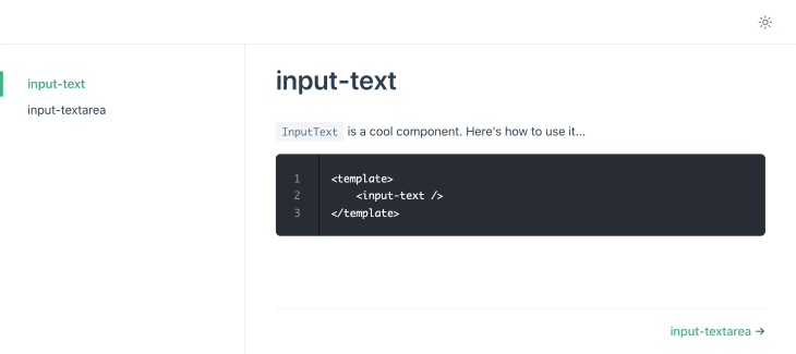
To document the two components in the library, let's create two markdown files in another new subfolder, docs/components. These files are where you will explain the component API, provide usage examples, and whatever else will help the user.
# input-text `InputText` is a cool component. Here's how to use it... <template> <input-text /> </template>
In addition to regular markdown text and code, VuePress allows for interactive component demos by mounting your component to a Vue instance within the docs page. You can learn more about that here.
When VuePress runs, these markdown files will be published as pages. To make these pages accessible, we'll add them to the docs sidebar by adding the following theming info to the VuePress config file:
module.exports = { themeConfig: { sidebar: [ { title: 'Components', collapsable: false, children: [ '/components/input-text.md', '/components/input-textarea.md' ] } ] } } Check the browser. Your VuePress site will now look something like this:
Publishing docs to GitHub Pages
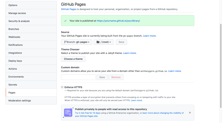
To publish our docs publicly, we can use GitHub Pages, which allows for free static hosting.
Assuming you don't want a custom domain, your Pages site URL will probably be this:
https://<yourname>.github.io/<yourlibrary>/
The important thing to note is that it will be in a subfolder, not the root directory. For this reason, you need to provide a base config option in the VuePress config so that relative paths work correctly.
docs/.vuepress/config.js
module.exports = { ... base: '/yourlibrary/' } With that done, we'll now create a deploy script. This script will build the docs, commit the build to the branch gh-pages, and then push the commit to GitHub where it will be published.
If you haven't already, ensure your component library is published to GitHub (yourname/yourlibrary). Run the script, and your static build will be pushed to the repo.
deploy.sh
#!/usr/bin/env sh set -e npm run docs:build cd docs/.vuepress/dist git init git add -A git commit -m 'deploy' git push -f git@github.com:yourname/yourlibrary.git master:gh-pages cd -
To tell GitHub to publish the site, you can turn on the Pages feature in the repo settings. Make sure you select the branch gh-pages and source files from the root directory.
Conclusion
In this article, we've seen how to create a Vue 3 component library and publish it to npm, as well as publish the docs on GitHub Pages.
With this recipe, you can create libraries that will allow consistency across your own projects or provide some great open-source components to the Vue community.


No comments:
Post a Comment
Note: Only a member of this blog may post a comment.